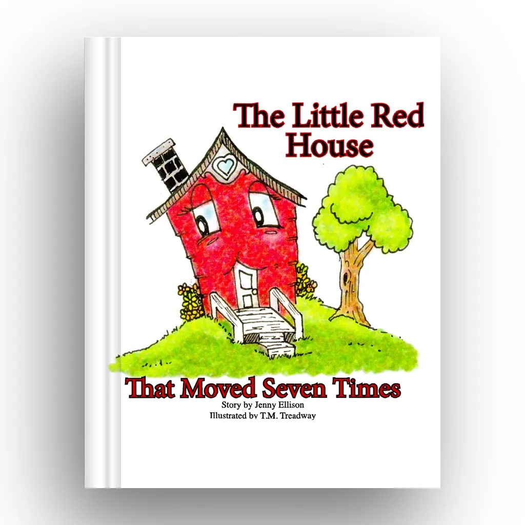
Original Design
"The Little Red House Who Moved Seven Times" is a delightful tale of resilience and adventure, following a charming red house as it travels through seven different locations. Through captivating hand-drawn illustrations, readers are immersed in the journey, encountering new landscapes and characters with each move.
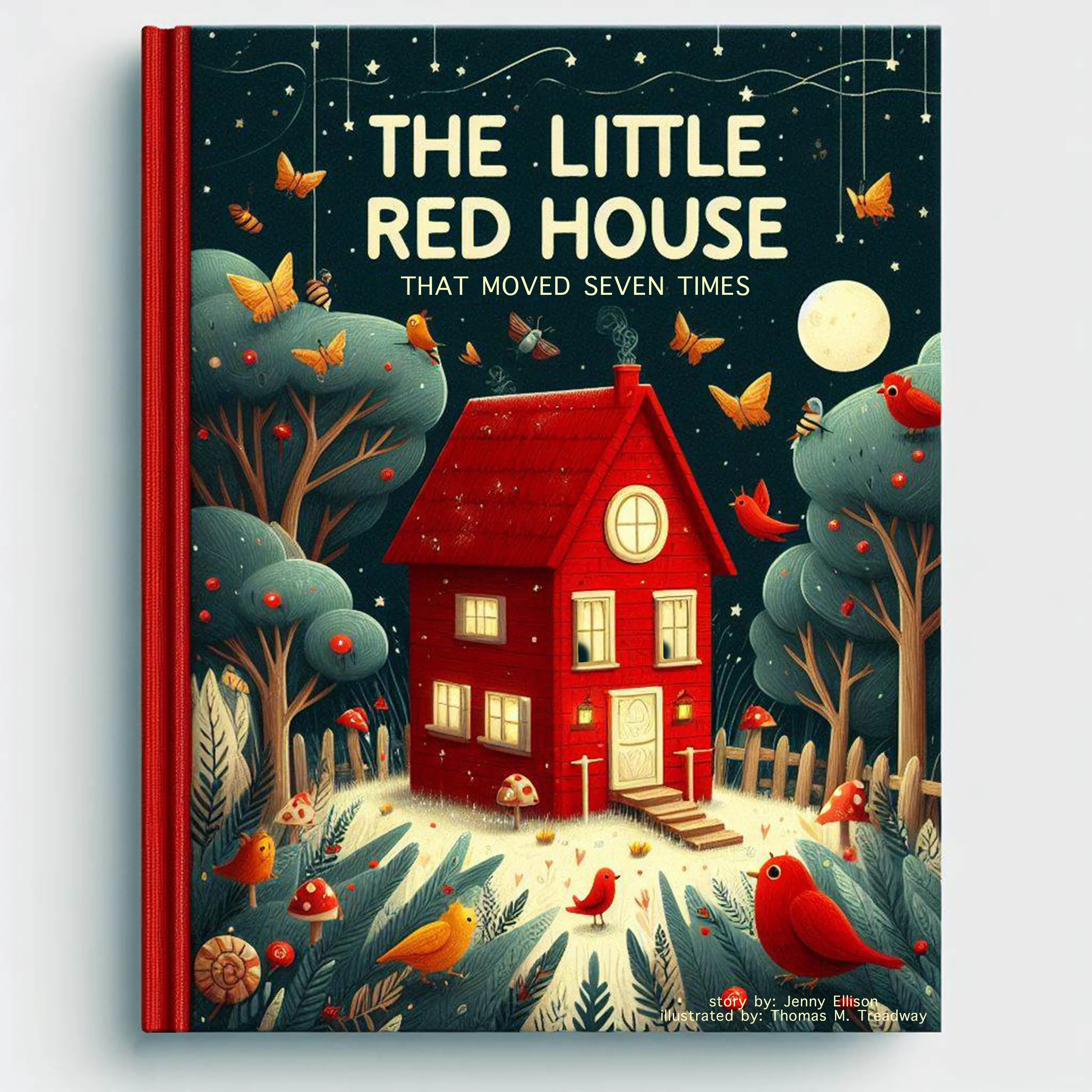
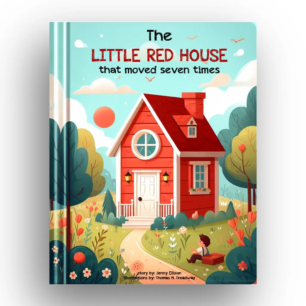
Re-Imagined 1
Occasionally, I enjoy revisiting my past creations and using them as inspiration for new designs.
Re-Imagined 2
This process often sparks intriguing ideas and fresh perspectives on my work.
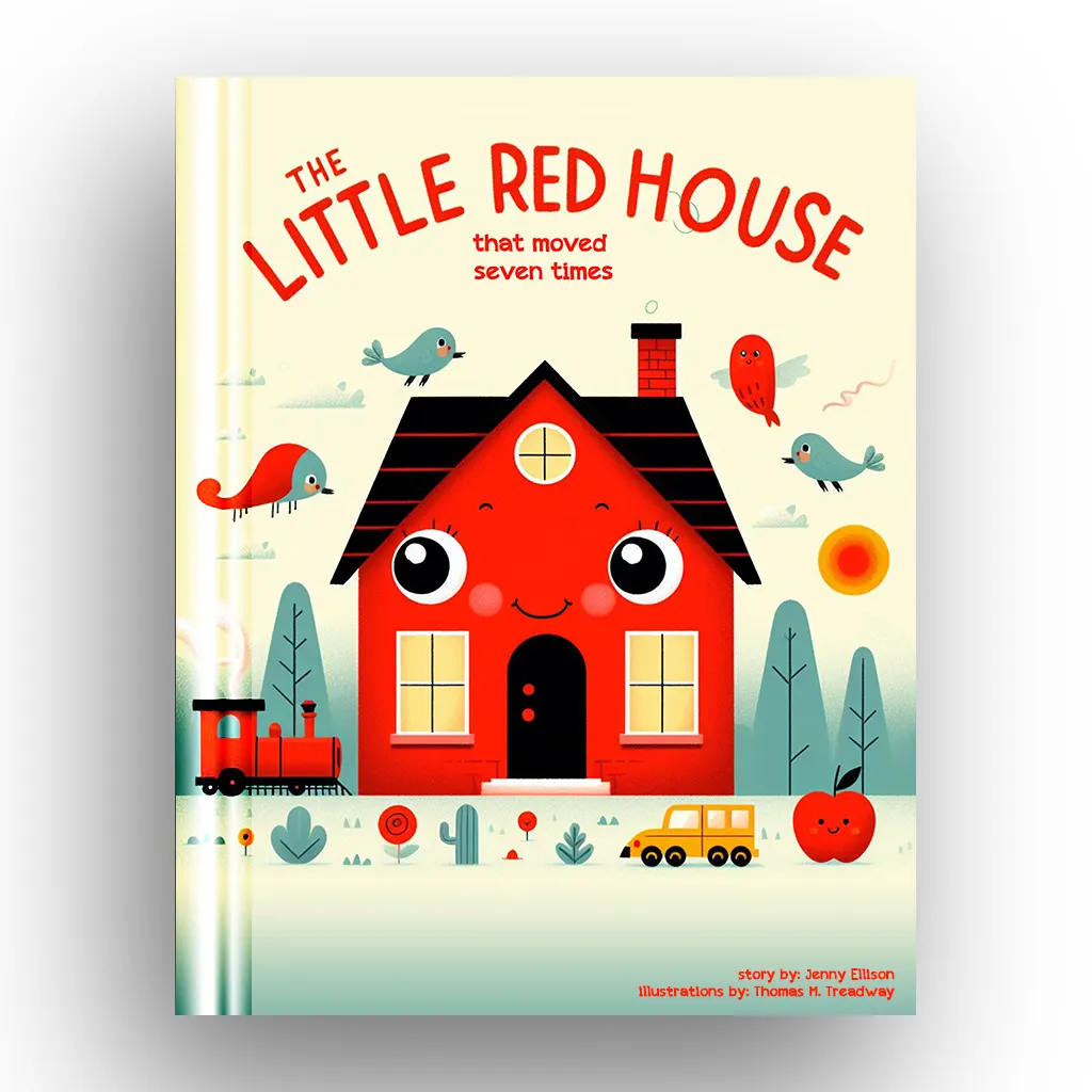
Re-Imagined 3
I believe that each of the three covers effectively communicates the same message, albeit from distinct stylistic viewpoints.
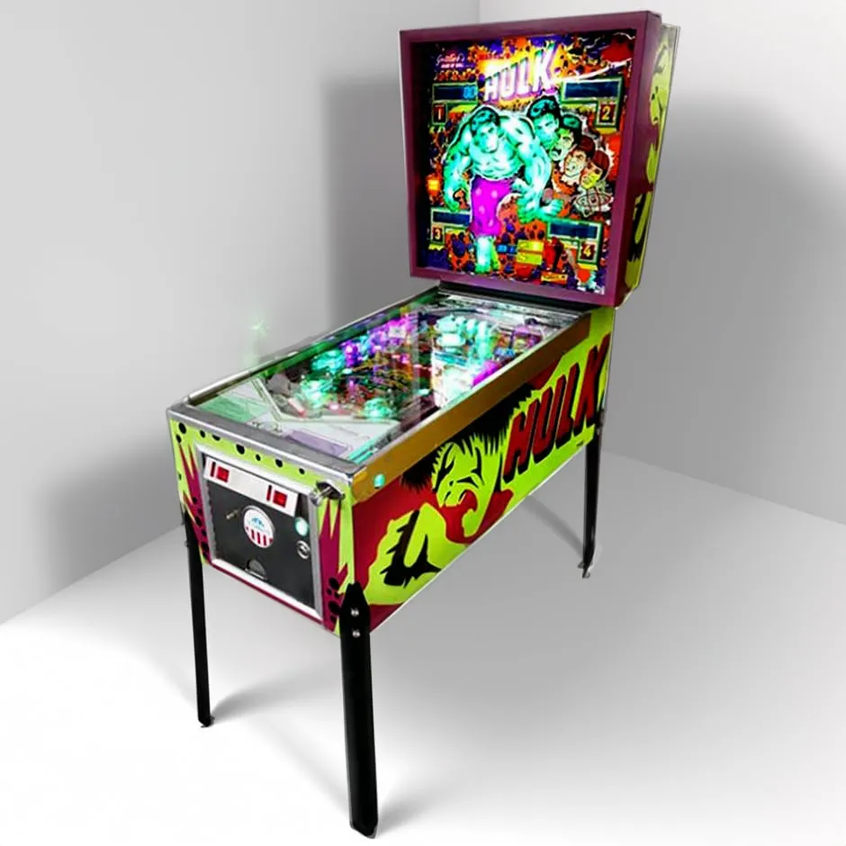
Original Design
Every now and then, I receive inquiries about custom graphics projects. Sometimes, it's for something I've never done before but thoroughly enjoy, like the vintage Hulk pinball machine Iproject worked on.
On the left are the original graphics, quite rudimentary in nature. They feature flat paint and stenciled graphics
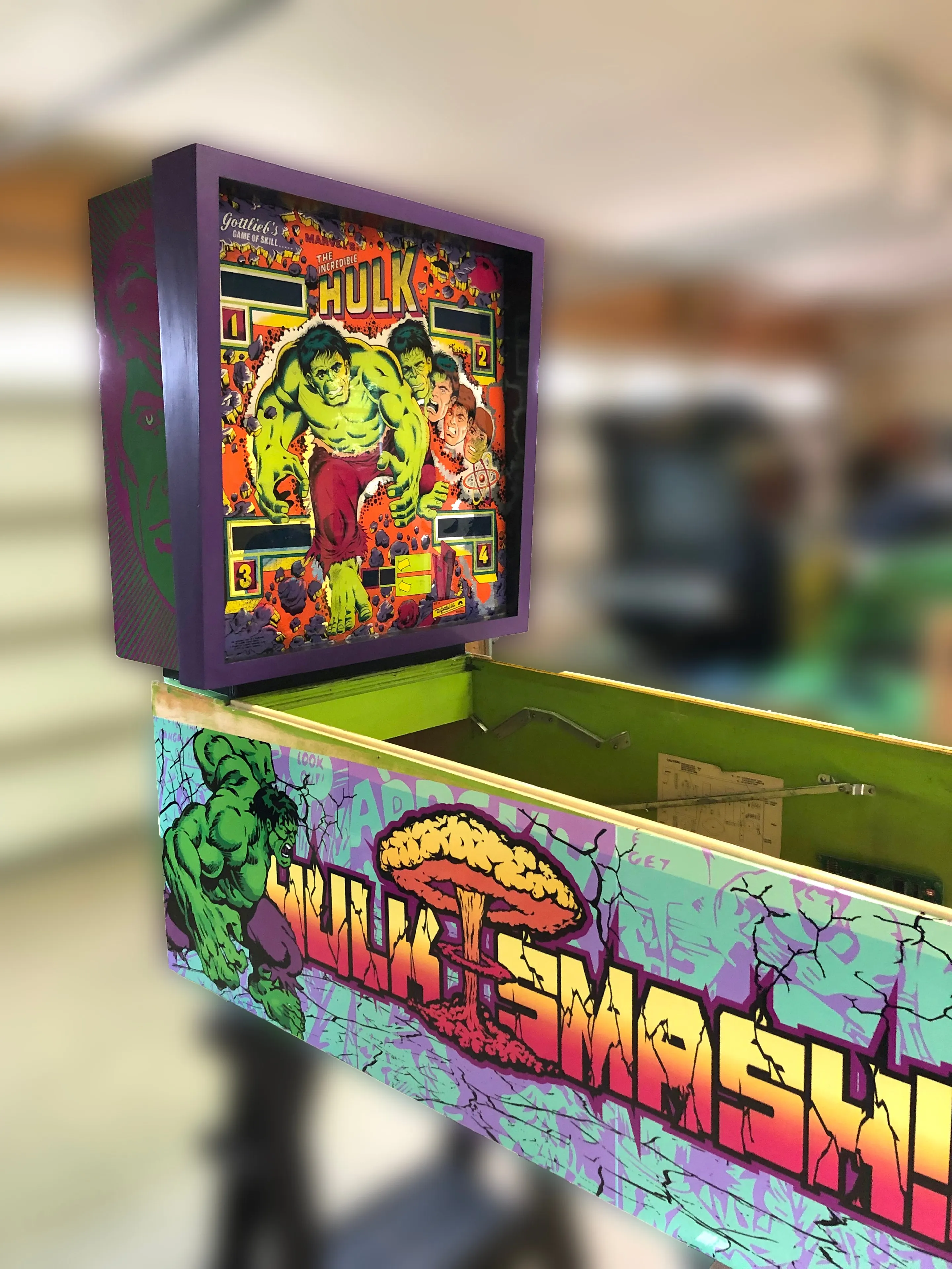
Updated Graphics
As evident, I crafted custom side panels depicting the Hulk in all his glory, accompanied by a gamma blast in the background. Vintage Hulk comic panels adorn the backdrop, cracked from the force of the blast.
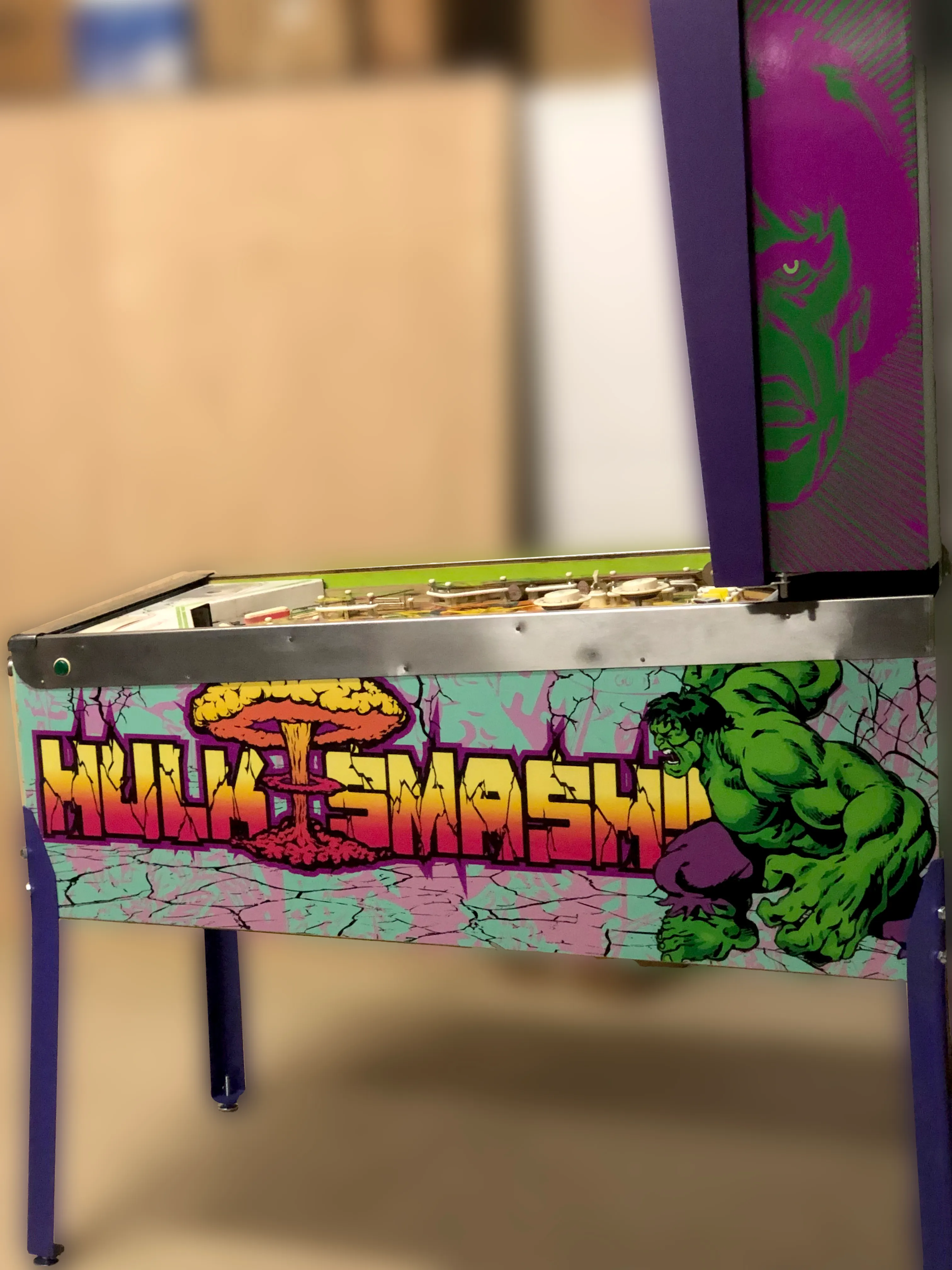
Base Side Pannel
My aim was to infuse vibrancy and color reminiscent of the comic book palette. With a iconic quote "HULK SMASH"!
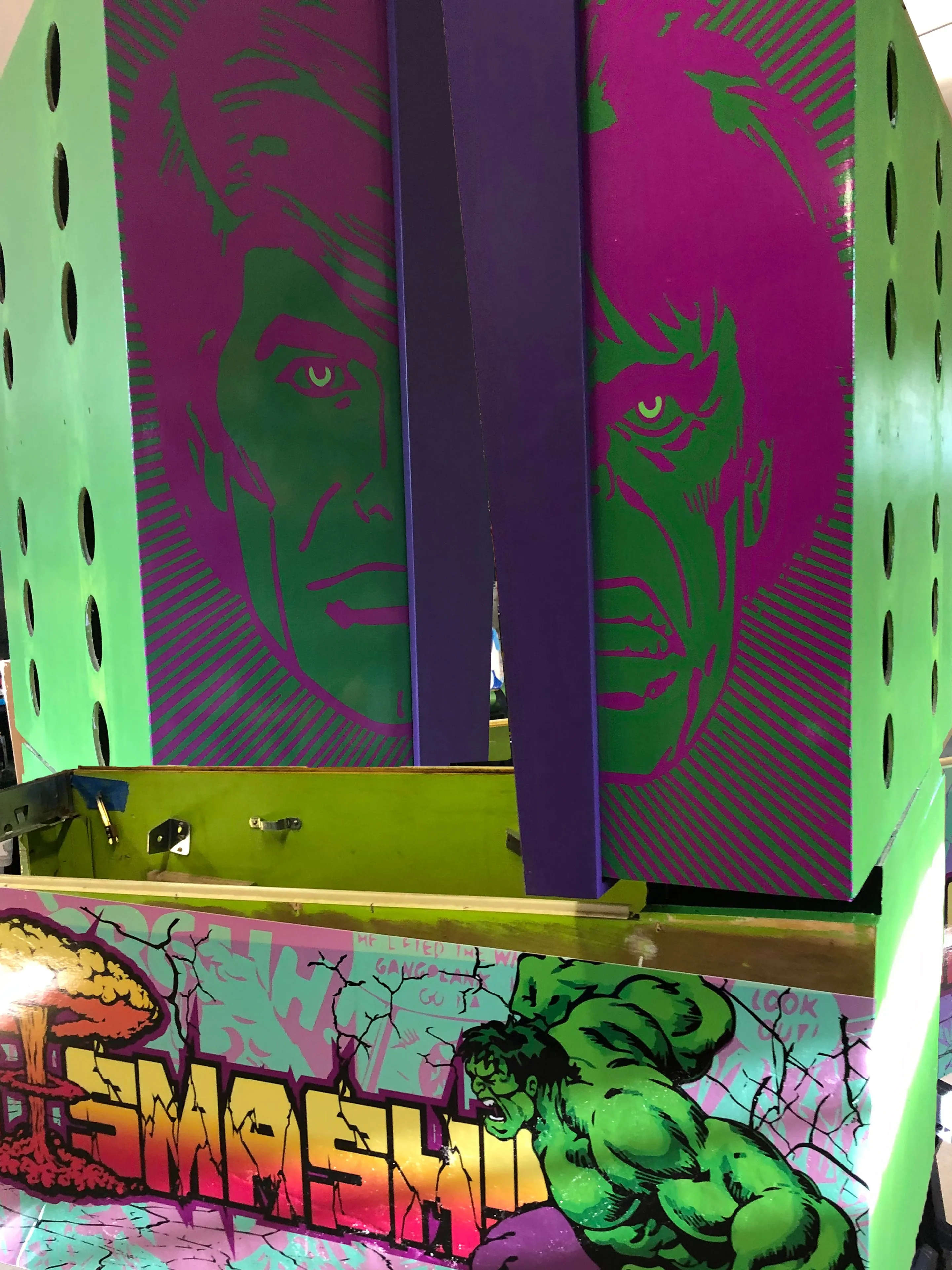
Head Pannel
The custom side panel graphics illustrate the transformation from mild-mannered Bruce Banner to the raging Hulk. I opted for the classic two-color scheme of green and purple, reminiscent of the original side panels.
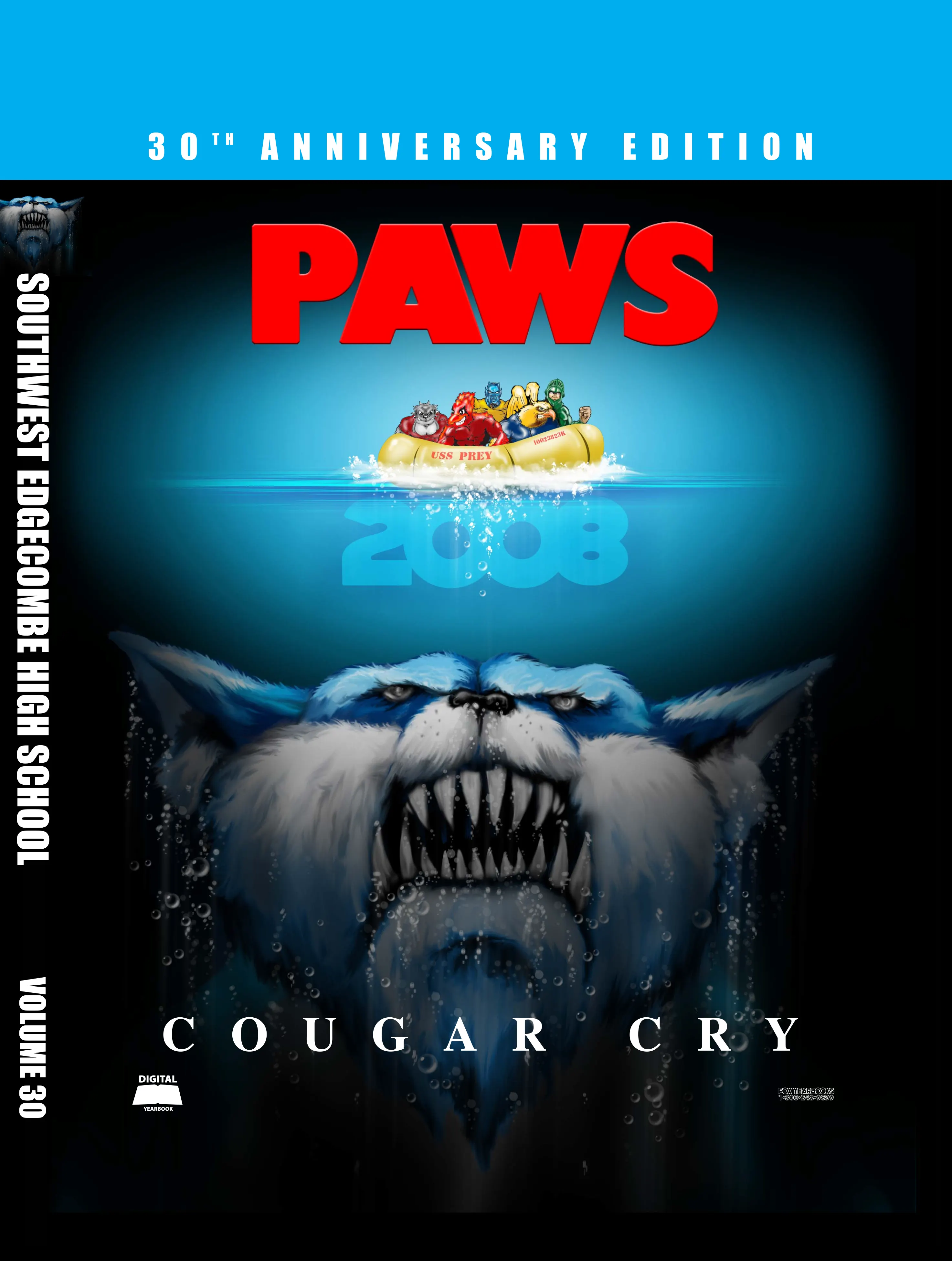
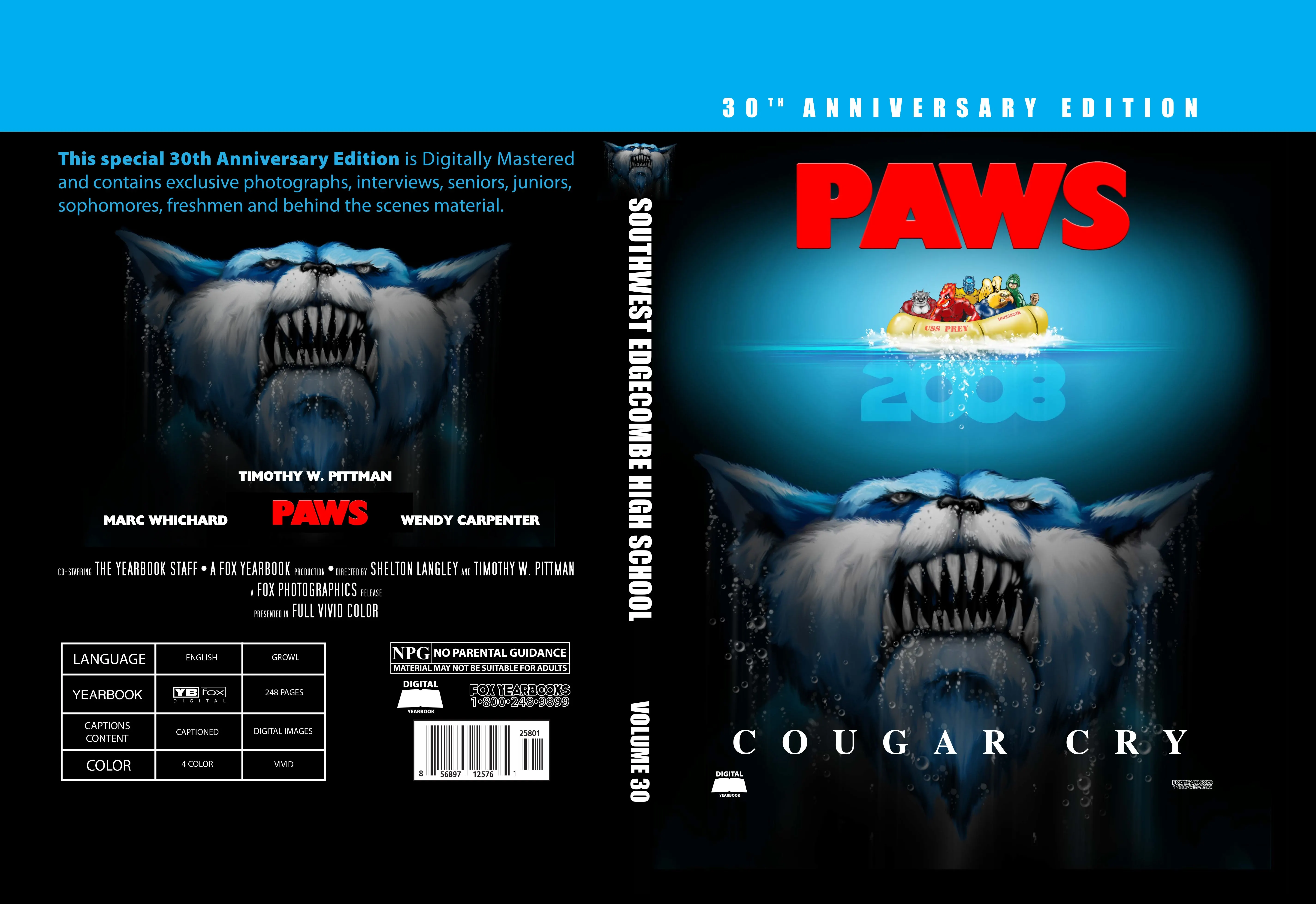
Custom Cover Design
The image depicts a custom cover design for the 30th Anniversary Edition of the "PAWS" yearbook for Southwest Edgecombe High School, titled "Cougar Cry." The cover is designed as a homage to the classic "Jaws" movie poster, featuring a menacing cougar with sharp teeth emerging from underwater, evoking a sense of danger and suspense. Above the cougar, a group of people is shown in a small raft labeled "Senior Prey 2008," suggesting that the yearbook captures memories and moments from that year.
The yearbook's details are presented in a cinematic style, with credits similar to a movie poster, listing contributors such as Timothy W. Pittman, Marc Whichard, and Wendy Carpenter. The cover also highlights that the edition is digitally mastered and includes exclusive photographs, interviews, and behind-the-scenes material, covering seniors, juniors, sophomores, and freshmen.
The back cover features technical details in a style mimicking movie information, such as language ("Growl"), content ("Captioned"), and color ("Vivid"). The yearbook is described as having 248 pages, with vivid 4-color printing, and is available in both digital and physical formats. There is a "No Parental Guidance" warning, humorously noting that the material may not be suitable for adults.
The overall design is bold, creative, and intended to capture the viewer's attention with its unique blend of school spirit and cinematic homage.
